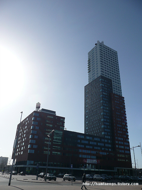
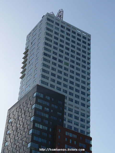
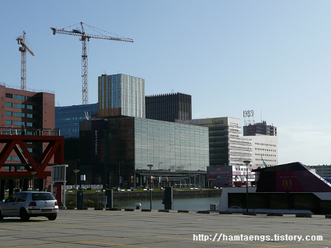
1박2일 코스라서 특별한 준비없이 출발한 네델란드....큰 코 다칠 뻔 했다.
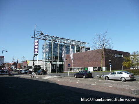
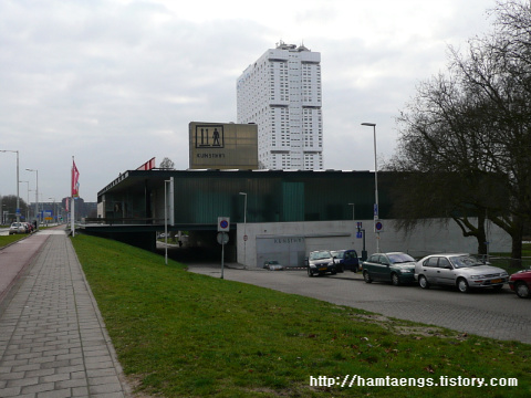
암튼 쿤스탈을 시작으로 짧은 일정을 시작했다.
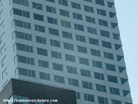
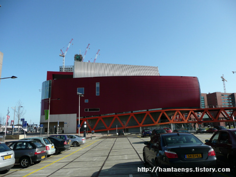
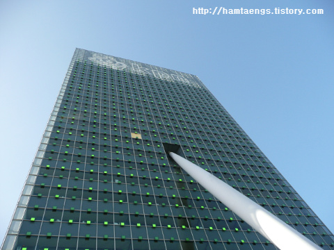
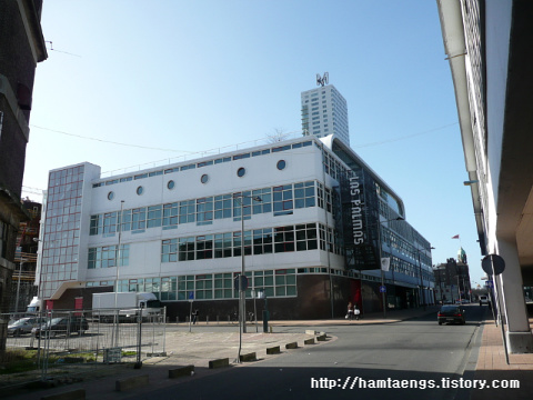
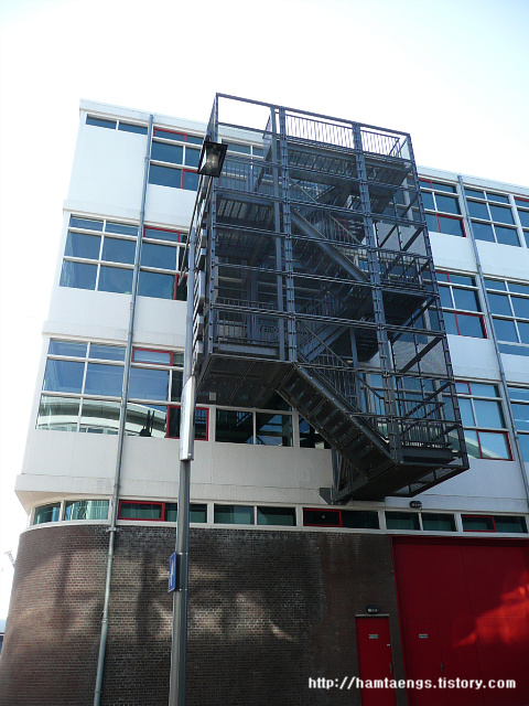
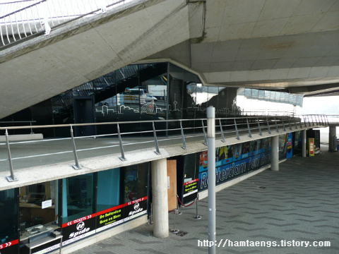
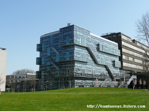
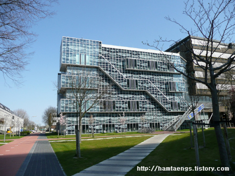
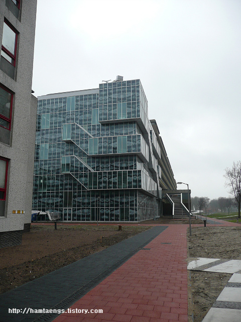
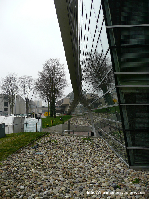
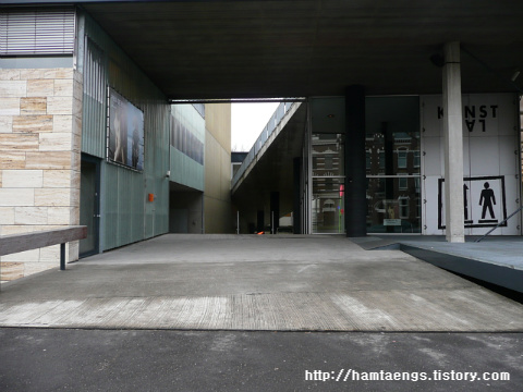
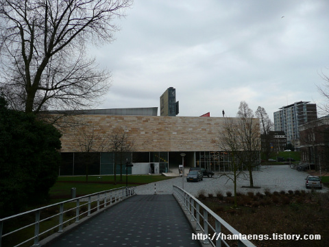
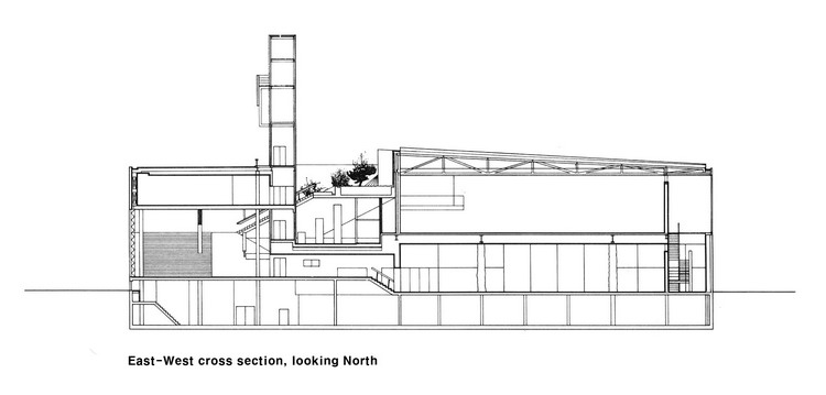
도로옆에 바짝 붙어 있는 쿤스탈... 건물 하부로도 차들이 지나다닐 수 있게 터널이 있다.
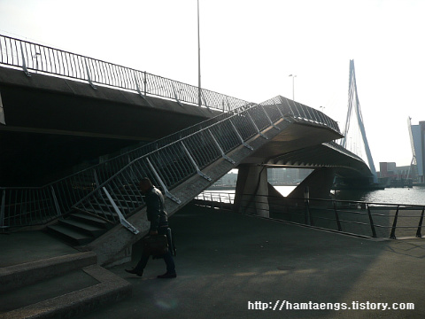
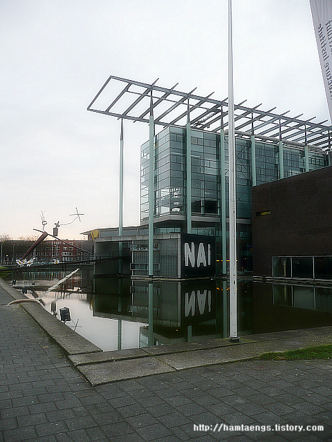
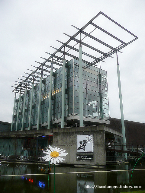
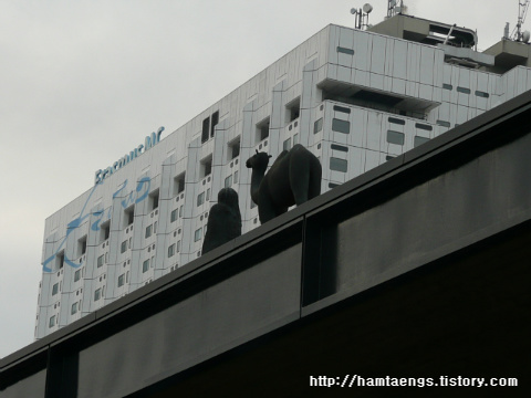
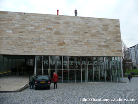
건물 가까이 다가가면 반대편을 내려가는 경사로가 있고, 건물 지붕을 보면 조형물들이 있다.
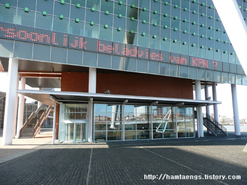
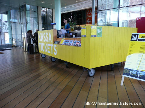
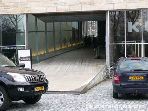
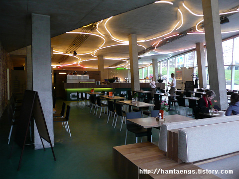
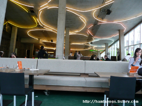
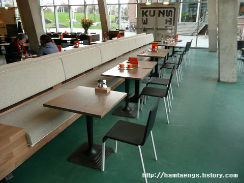
경사로를 내려가다가 중간즈음에 매표소가 있고 좀 더 내려오면 카페가 있다.
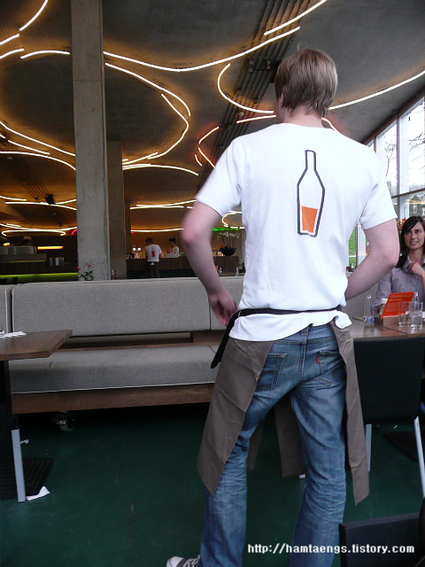
종업원의 티셔츠가 흥미를 유발시킨다. 등쪽에 그려진 술?? 채워진 병.... 종업원마다 채워진 양이 다 틀리다.
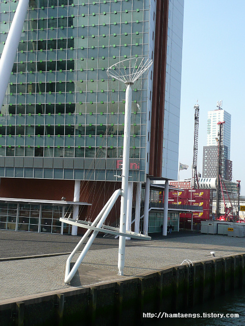
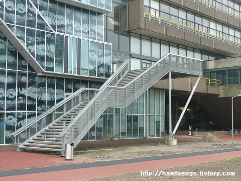
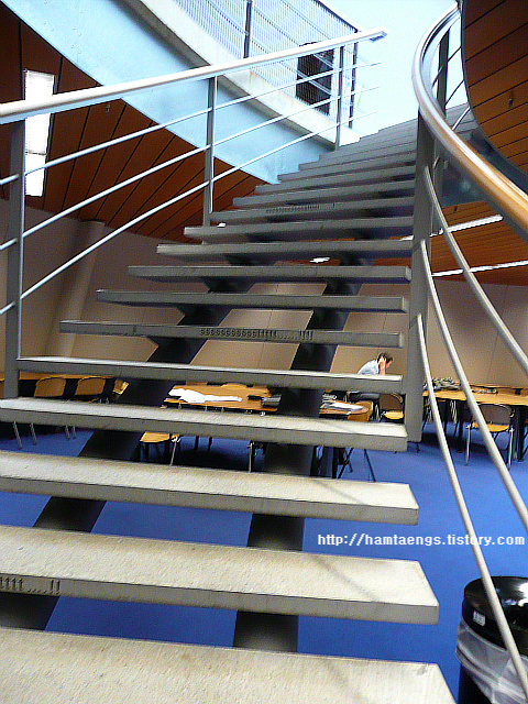
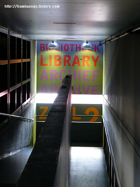
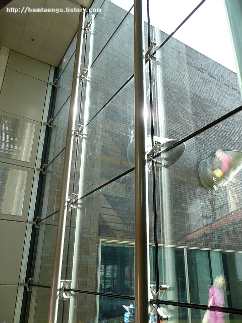
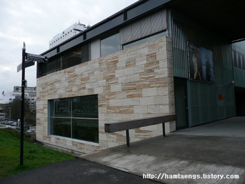
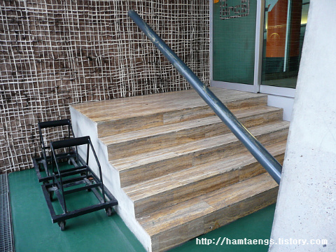
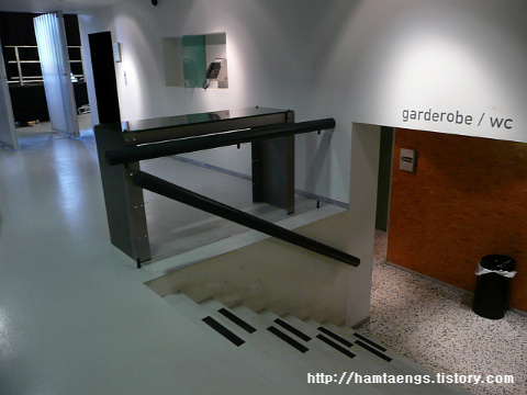
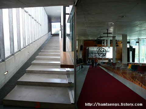
벽에 홀로이 고정된 핸드레일
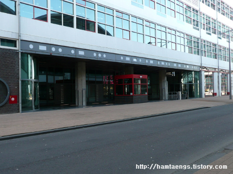
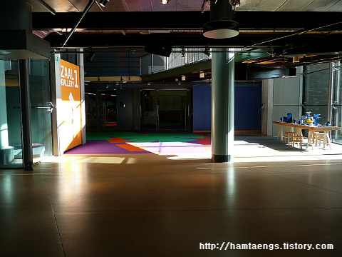
다시 램프 중간으로 올라가면 매표소에서 표를 끊고 전시관 내부관람 시작...
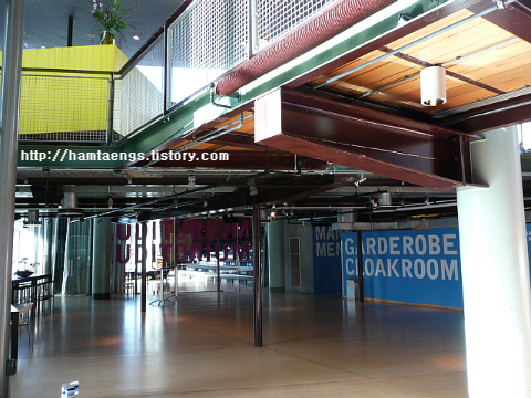
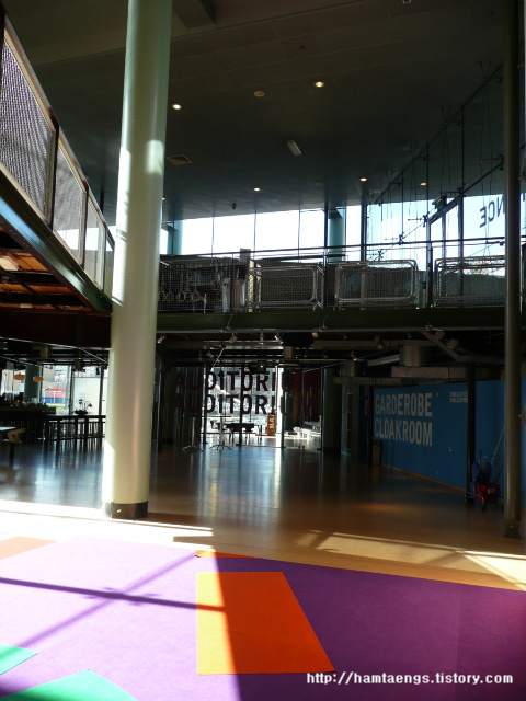
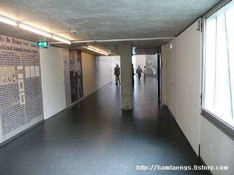
옷 또는 가방보관소, 화장실로 가는 입구
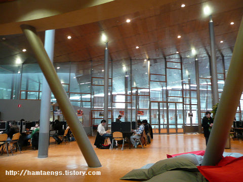
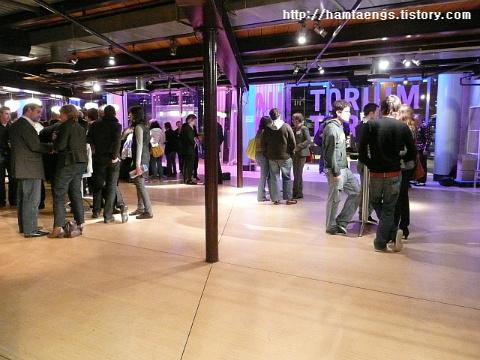
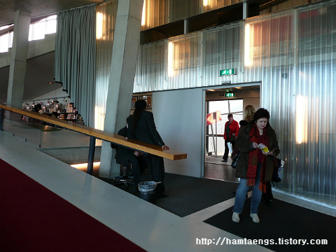
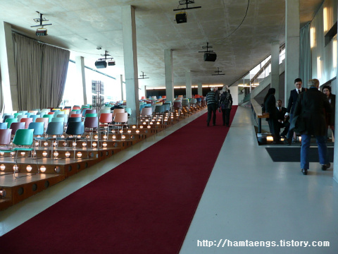
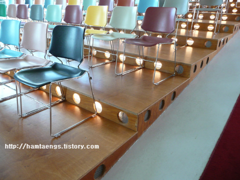
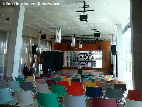
매표소 앞의 강의실
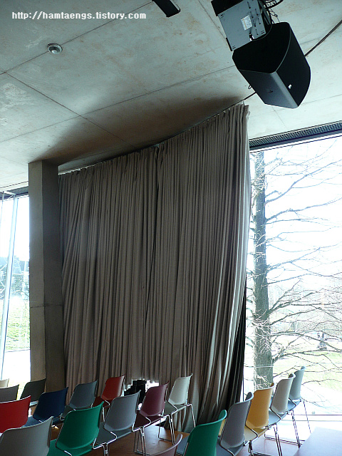
영상물 감상을 위한 암막커텐
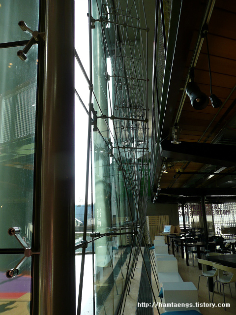
심플한 프레임들
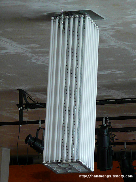
단순한 형광등의 모습이 이렇게도 바뀔 수 있다는.........
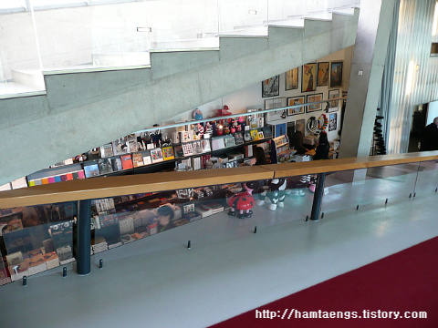
자투리공간의 기념품판매소
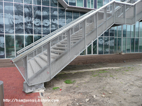
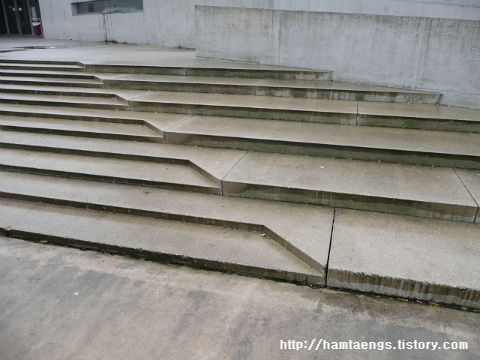
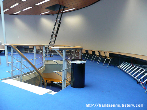
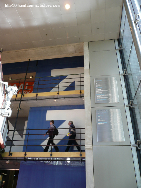
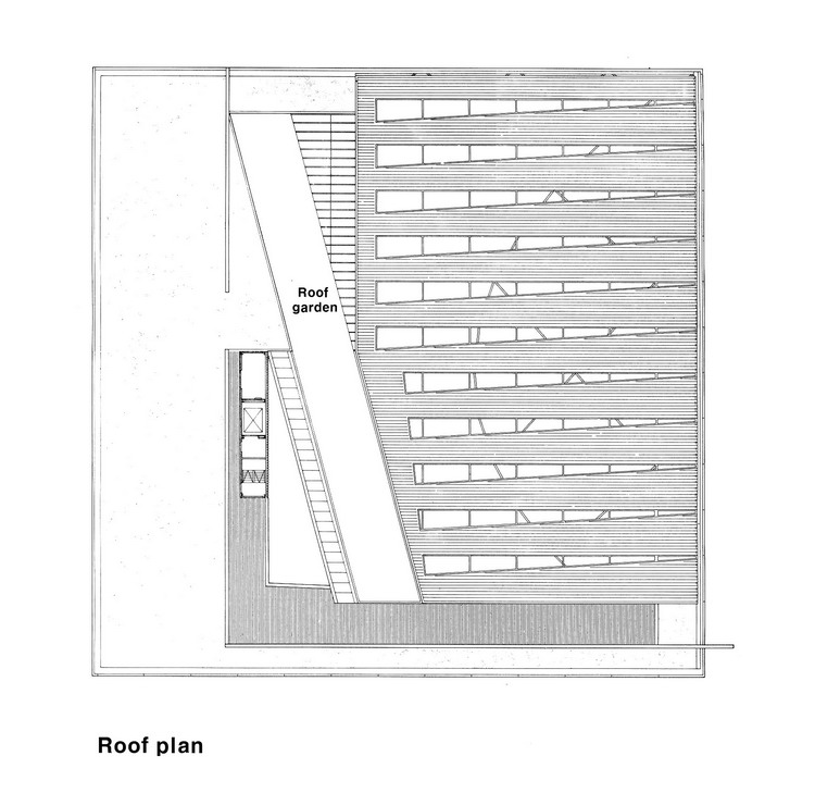
최초 진입시의 경사로(우)와 옥상으로 연결된 계단(좌)
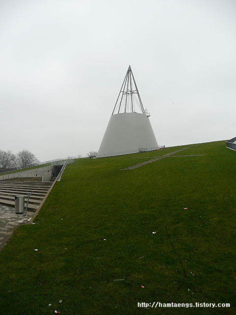
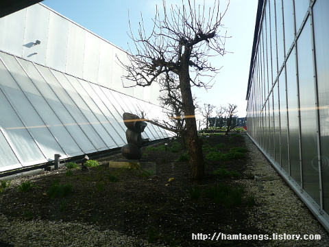
옥상정원공간
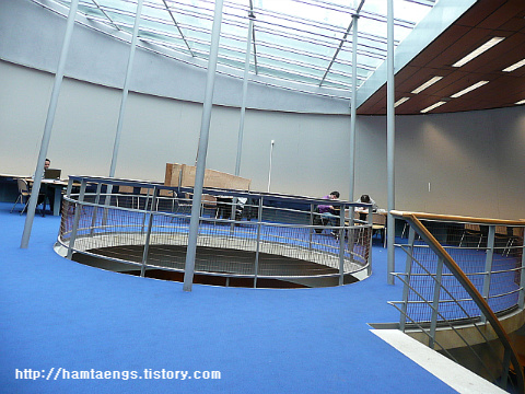
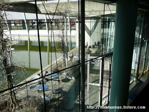
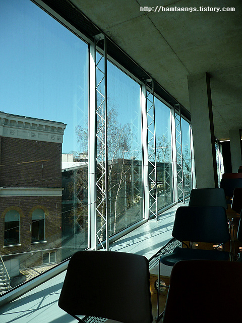
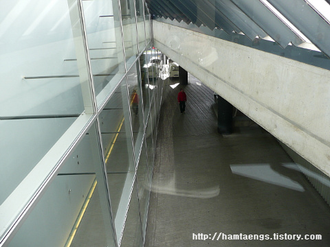
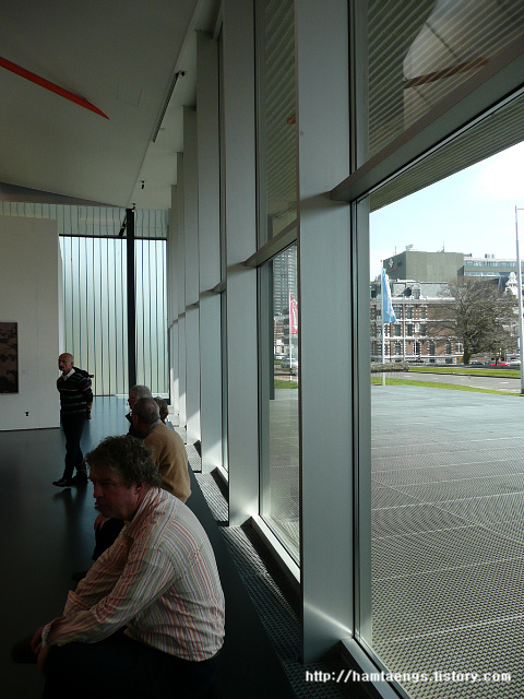
유리벽을 사이에 두고 전시공간의 복도(좌)와 외부 경사로(우)
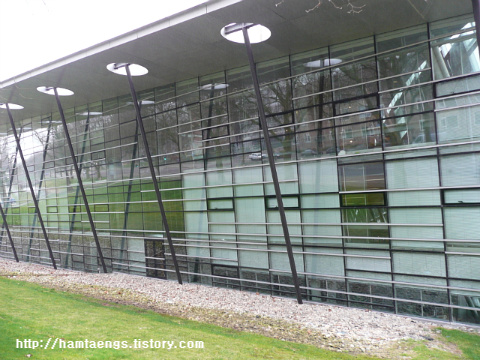
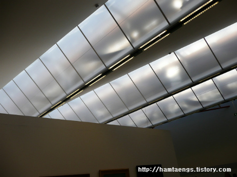
폴리카보네이트와 철제 트러스형식 구조의 결합
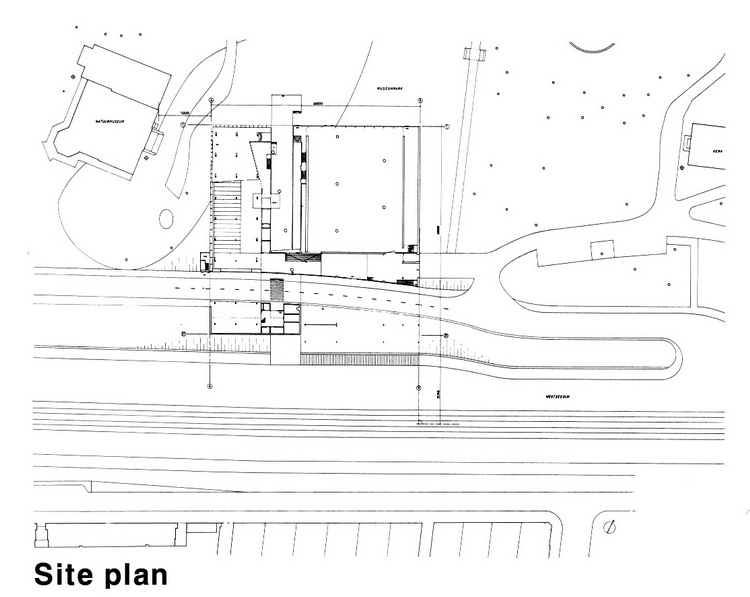
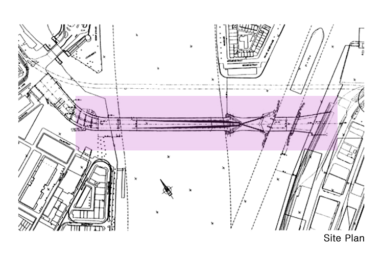
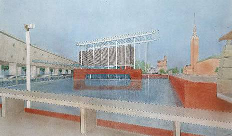
Westzeedijk, Rotterdam, The Netherlands, 1992
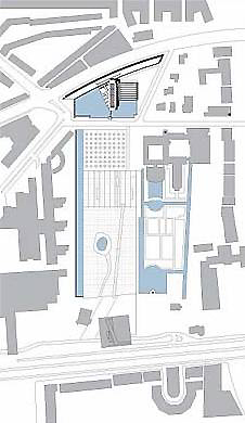
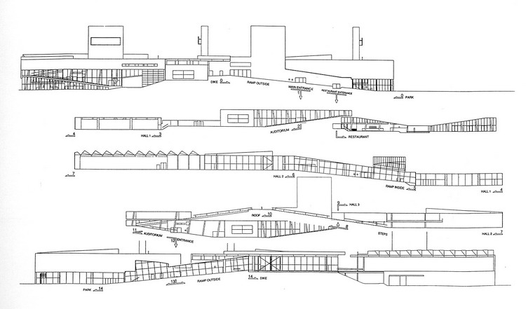
대지는 이중적인 조건(a dual condition)을 나타내고 있다. 대지의 남단은 제방(dike) 위에 위치한 고속도로(highway) 마아스바울레바르트(Maasboulevard) -街에 의해 경계가 이뤄져 있고, 상대적으로 낮은 높이의 북단은 일상적인 명상(conventional contemplation)을 위한 박물관 공원(the Museum Park)과 마주보고 있다. 프로젝트 계획서(program)에는 통합되거나 분리되어 사용될 수 있는 세 개의 主전시공간(major exhibition space)과 강연장(auditorium) 그리고 독립적으로 접근(운영)이 가능한 식당(restaurant)이 요구되었다.
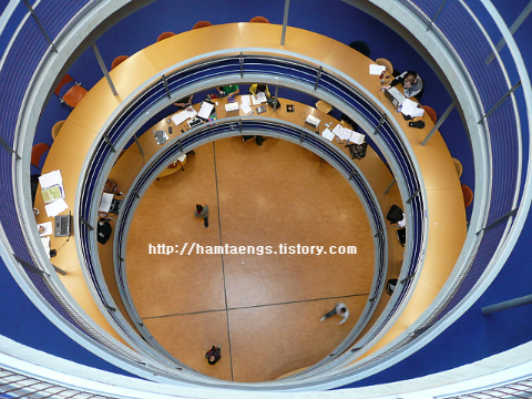
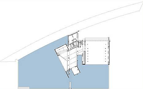
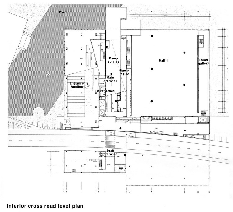
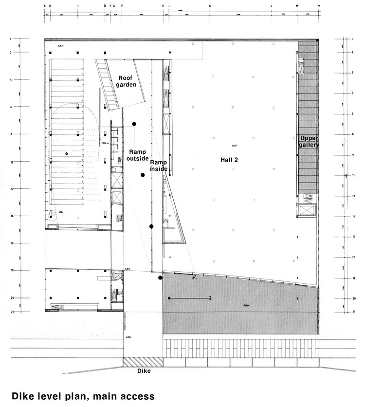
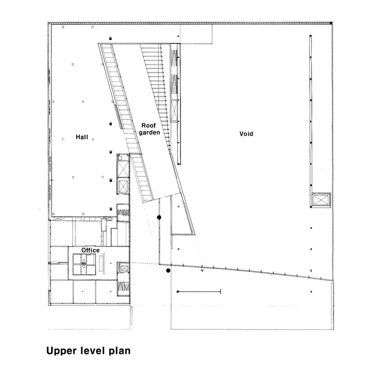
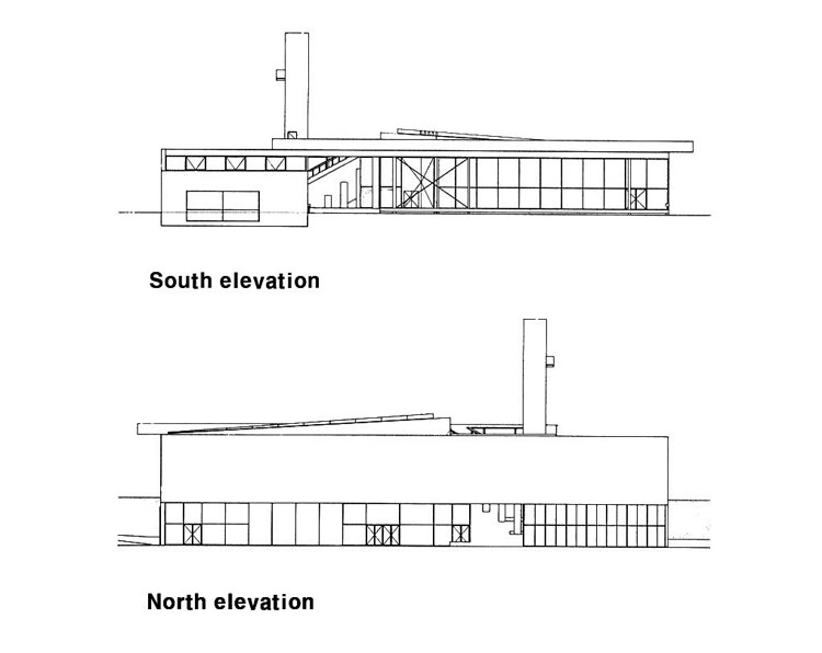
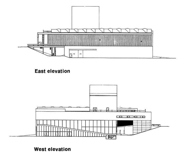
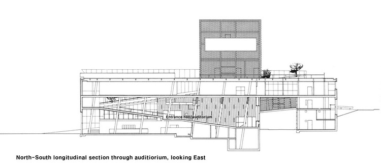
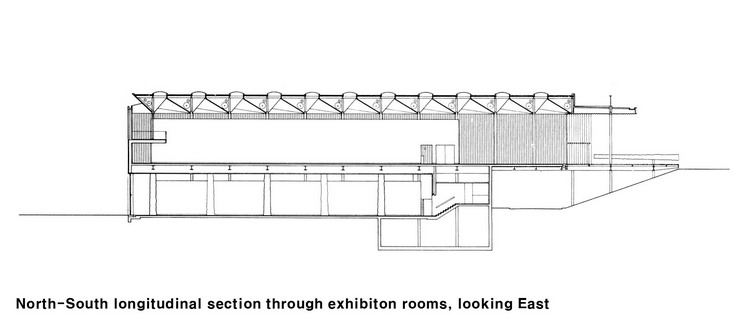
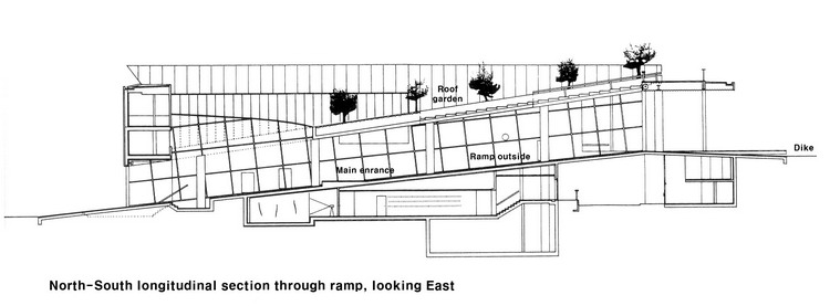
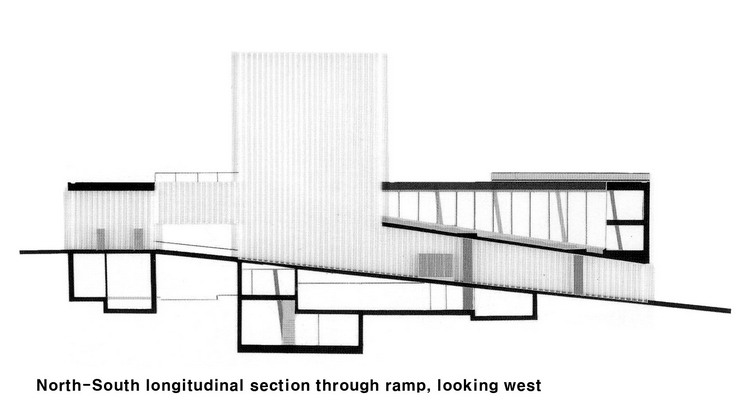
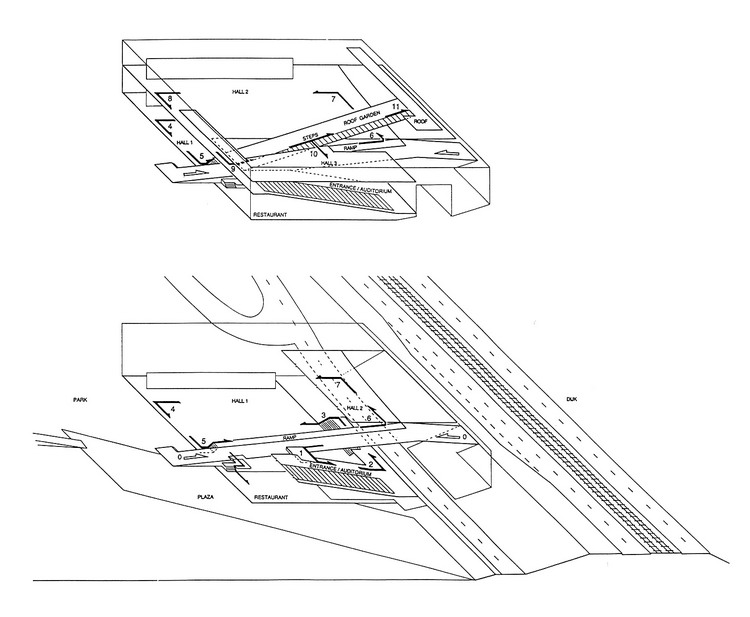
쿤스탈 미술관은 두 개의 통로가 교차된 사각형 상자처럼 보인다. 그 중 하나는 마아스바울레바르트-街와 평행하게 동서를 연결하는 도로이고, 다른 하나는 공원으로 향해 관통하여 있는 공용(옥외) 경사로에 의한 남북 축이다. 프로그램, 대지 조건과 사각형 건물을 4개로 나누고 있는 십자형 통로가 이 프로젝트에 대한 도전의 출발점이 되었다. 하나의 미술관을 4개의 독립된 프로젝트(four autonomous projects)로 계획하면서, 이로 인해 상대적으로 차이가 큰(contradictory) 공간 경험의 시간과정(sequence)을 극복하고 연속적인 나선구조(a spiral)를 형성할 수 있는 방안을 마련하여야 했다. 다시 말해서, 4개의 분리된 사각형의 공간 속에 나선형 연결 구조를 함께 상상하여야 했다. 이 결과 건물의 개념(concept)은 연속적인 순환과정(continuous circuit)으로 결정되었다.
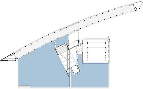
첫 번째 보행용 경사로(the pedestrian ramp)는 유리 벽면에 의해 공용 공간으로 개방된 외부와 순환통로(circuit)의 일부인 내부, 둘로 나누어지고 있다. 첫 번째와 평행하지만 반대 방향으로 연결된 두 번째 경사로는 강연장과 그 하부의 식당 부분을 위하여 테라스처럼 구성되어 있다. 그리고 두개의 경사로가 교차하는 부분에서는 주출입구(the main entrance)가 위치하고 있다. 그 곳에서 방문객들은 공원으로 내려가거나 제방쪽으로 올라가는 첫 번째 경사로와 만날 수 있다. 첫 번째 홀(hall 1)로 진입 공간에서 사람들은 계단으로 전면이 막힌 곳에 이르게 되는데, 이 곳을 지나면 푸른 잎을 배경(backdrop)으로 나무 기둥들의 조경 경관과 때때로 공원측 정면에 있는 다양한 종류의 유리면에 의해 형태가 굴절된(distorted) 모습을 점차 볼 수 있게 된다. 그 곳에서 사람들은 내부 경사로(the inner ramp)를 따라 넓게 천창이 개방되고 가로(the boulevard)에 면한 홀 2(hall 2)로 이동할 수 있다.
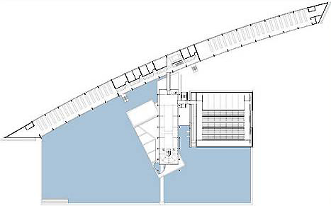
옥상정원(roof garden)을 따라 만들어진 세 번째 경사로는 더욱 친근감 있는 단층(single-height) 높이의 홀(hall)과 더욱이 지붕 테라스(the roof terrace)로 연결되어 있다. 대지는 고속도로와 박물관 공원(Museum Park) 사이에 놓인 60 * 60㎡ 규모로, 인접하여 자연사 박물관(Nature Museum)이 있다. 이 공원의 마스터 플랜(master plan)은 OMA의 디자인이며, 공원 내에는 보에이만스 판 뵈닝헌 미술관(Boijmans van Beuningen Museum)과 네덜란드 건축 협회(Netherlands Architecture Institute)가 위치하고 있다.
쿤스탈 미술관은 연면적 7,000㎡의 철골철근 콘크리트 구조의 건축물이며, 순회 전시회(travelling exhibitions)를 위한 전람 홀(Expo hall)을 주공간으로 한다. 공사 예산은 1,500만 유로로 1992년에 완공된 로테르담-市 소유의 미술관이다.
- 건축설계정보 참조 -